
Frutiger Aero button generator
Create glossy Frutiger Aero buttons, with gloss, glass rim, bubbles and shadow, and download them as PNG.
This is a free online tool that generates Frutiger Aero buttons: the shiny, glassy, bubbly buttons of the mid 2000s, the ones you remember from Windows Vista, Windows 7, the first iPhone and every Web 2.0 website.
Choose a color and the tool builds the whole glossy look for you: a vertical gradient body, a bright specular highlight on the top half, a soft glow bouncing from the bottom and a drop shadow. Every one of those layers can also be adjusted by hand, and you can add a border, a light rim around the glass edge and floating soap bubbles over the button for the full Frutiger Aero effect.
The result is downloaded as a PNG file with transparency, so you can use it in websites, games, apps, presentations, thumbnails or anywhere else.
Everything runs directly in your browser. No downloads or installations required, and nothing is ever uploaded to a server.
The image is 100 x 100 pixels. The checkered squares show the transparent areas of the image: they are not part of the downloaded PNG file.
How to generate a Frutiger Aero button?
To create your glossy button, follow these simple steps:
- Click one of the styles - The buttons above the preview ("Aqua blue", "Vista glass", "Eco green", "Bubblegum" and the others) apply a complete Frutiger Aero style. It is the fastest way to start.
- Type the text of the button - Write the label in the first field, and choose the font, the size and the color. Press ENTER to write a second line.
- Choose the shape - Set the width and the height in pixels. The button is fully rounded by default: turn off "Pill shape" to choose the corner radius yourself.
- Choose the color - Pick the button color and the tool generates the light top color, the dark bottom color, the border color and the glow automatically. Turn off "Generate the gradient from the button color" to choose each one by hand.
- Adjust the glass effects - The gloss is the bright highlight on the top half, and the bottom glow is the light that bounces back from the bottom. To draw a defined edge around the button, turn on the border and the glass rim, which is the thin light line just inside the border.
- Add the bubbles (optional) - Turn on "Add floating bubbles", choose how many bubbles float over the button and how big they are, and click "Shuffle the bubbles" until you like the way they are spread.
- Choose the background - Keep it transparent, so the button can be placed over anything, or fill it with a solid color or a vertical gradient.
- Download the button image - Click "Download button image" to save the result as a PNG file.
What is Frutiger Aero?
Frutiger Aero (also called Web 2.0 Gloss, Aero Glass or simply the "2000s glossy look") is the design style that dominated technology roughly between 2004 and 2013. It is named after the Frutiger typeface and after Windows Aero, the interface of Windows Vista and Windows 7.
These are the ingredients that make a button look Frutiger Aero, and how this tool draws each one:
| Ingredient | How it is drawn |
|---|---|
| Glossy highlight | A bright white shape over the top half of the button, fading downwards, either floating inside the glass as a smaller rounded highlight or spread over the whole width with a curved bottom edge, like the reflection on a rounded piece of glass. |
| Vertical gradient | The body goes from a light tone at the top to a darker tone at the bottom, which makes the surface look convex. |
| Glass rim | A thin, light, semi transparent line drawn just inside the border, like the polished edge of a glass panel. This tool draws it when you turn on the glass rim. |
| Reflected light | A soft glow at the bottom of the button, as if the light bounced from the surface below and came back into the glass. |
| Bubbles and water | Translucent soap bubbles with a bright rim and a small reflection, floating over the surface. This tool draws them when you turn on the bubbles. |
| Soft drop shadow | A blurred shadow slightly below the button, so it looks like it is floating over the page. |
| Clean humanist type | A rounded, friendly sans serif font, usually white and bold, with a subtle shadow to lift it from the background. |
Skeuomorphism went out of fashion around 2013, when flat design took over, but the Frutiger Aero look came back as a nostalgic aesthetic and is used again in personal websites, games, album covers and social media.
Text options
| Field | Description |
|---|---|
| Button text | The label drawn in the middle of the button. Press ENTER to add a second line: the lines are centered one below the other. |
| Font | The font family used to draw the text. The list contains the fonts that are available on almost every computer. Choose "Custom font family" to type the name of any font installed on your computer. Humanist sans serif fonts, like Segoe UI, Calibri or Trebuchet MS, are the ones closest to the original Frutiger Aero interfaces. |
| Font size (px) | The height of the font, in pixels. A size around one third of the height of the button usually looks good. |
| Bold | Draws the text with the bold style of the font. Frutiger Aero buttons are almost always bold. |
| Text color | The color of the label, in hexadecimal format. You can also pick a color from the color picker, by clicking the square next to the field. White works well over saturated buttons, and a dark blue works well over light glass buttons. |
| Text shadow | Adds a shadow behind the text, which separates the label from the glossy background. Use a dark shadow with light text, and a white shadow with dark text to create the classic engraved look. |
| Text shadow opacity, blur and offset Y | How strong the text shadow is, how blurred it is, and how far below the text it is drawn. |
Shape and color options
| Field | Description |
|---|---|
| Width and Height | The size of the button, in pixels. The size of the image follows the size of the button, plus the padding and the space needed by the drop shadow. |
| Pill shape | Rounds the corners as much as possible, so the sides of the button become half circles. It is the classic shape of the aqua buttons, and it is turned on by default. Turn it off to choose the corner radius yourself. |
| Corner radius (px) | How round the corners are, in pixels. It is limited to half of the smallest side of the button. 0 produces a rectangular button. |
| Button color | The main color of the button. When the colors are generated automatically, this single color defines the whole button. |
| Generate the gradient from the button color | When this option is on, the light top color, the dark bottom color, the border color and the bottom glow color are all calculated from the button color. Turn it off to choose each color by hand. |
| Top color and Bottom color | The colors of the vertical gradient of the body of the button. The top color should be lighter than the bottom color, so the surface looks convex. |
| Border color | The color of the line drawn around the button, usually a much darker version of the button color. |
| Bottom glow color | The color of the light that is reflected inside the bottom of the button, usually a much lighter version of the button color. |
Glass effect options
| Field | Description |
|---|---|
| Gloss | The bright specular highlight drawn over the top of the button. It is the effect that makes the button look glossy. |
| Gloss shape | "Pill" draws a smaller rounded highlight that floats inside the button without touching its borders, like the highlight of the aqua buttons: its rounded ends follow the corners of the button, so it stays inside the glass even when the button is very round. It is the shape used by default. "Curved" bends the bottom edge of the highlight downwards in the middle, like the reflection on a curved surface, and is the classic Web 2.0 look. "Straight" cuts the highlight with a horizontal line. |
| Gloss height (%) | How much of the height of the button is covered by the highlight. 50% covers the top half, which is the usual value. |
| Gloss opacity (%) | How bright the highlight is. High values produce a wet, plastic look, and low values produce a subtle satin look. |
| Bottom glow | A soft glow of light at the bottom of the button, as if the light bounced from the surface below into the glass. |
| Glow shape | "Ellipse" spreads the light as a wide dome that rises from the bottom edge across the whole width of the button, which is the usual reflected light. "Pill" draws a smaller rounded reflection floating near the bottom, with soft edges and rounded ends that follow the corners of the button, like the highlight of the aqua buttons. |
| Glow size (%) and Glow opacity (%) | How high the glow rises inside the button, as a percentage of its height, and how strong it is. |
| Border | The outline drawn around the button, always inside its shape, so the size of the image does not change. It is turned off by default, because the gradient alone already separates the button from the background: turn it on when the button is placed over a busy image and needs a defined edge. |
| Inner glass rim | A thin light line drawn just inside the border, which imitates the polished edge of a glass button. It is turned off by default: turn it on to choose its width and its opacity. It looks best together with the border. |
| Bubbles | Translucent soap bubbles floating over the button. They are turned off by default: turn them on to choose how many there are, how big they can be and how visible they are. |
| Bubble seed | The number that defines the position and the size of every bubble. The same seed always produces exactly the same bubbles, so you can reproduce a result later. Click "Shuffle the bubbles" to try another one. |
| Drop shadow | The blurred shadow drawn below the button, which makes it float over the page. Its color, opacity, blur and vertical offset can be adjusted. |
| Background | What is drawn behind the button: nothing (a transparent PNG), a solid color, or a vertical gradient. |
| Padding | The empty space between the button and the borders of the image, in pixels. The space needed by the drop shadow is added automatically. |
Frequently Asked Questions (FAQ)
Is this Frutiger Aero button generator free to use?Yes, this tool is 100% free and works directly in your browser, with no installation and no sign-up required.
Are my buttons uploaded to a server?No. The button is drawn by your own browser, on a canvas, and the PNG file is created on your computer. Nothing is ever sent to a server.
In which format is the button downloaded?The button is downloaded as a PNG file. When the background is left transparent, the transparency is kept in the file, so you can place the button over any color or image.
Can I use the generated buttons in a commercial project?Yes. The images you create with this tool are yours, and you can use them in websites, games, apps, videos or anything else, including commercial projects.
Does it generate CSS code?No, this tool generates an image. Some of the effects it draws, like the curved gloss and the bubbles, cannot be reproduced with CSS alone, which is exactly why an image is used.
How do I make the classic Windows Vista button?Click the "Vista glass" style, which uses a very light blue button, dark blue text with a white shadow, and a strong gloss with the "Straight" shape, because the highlight of the buttons of Vista is cut by a horizontal line. It also turns off the pill shape, since the buttons of the dialogs of Vista are rounded rectangles. Then reduce the corner radius to about 6 pixels and the height to about 40 pixels to get the proportions of a dialog button.
How do I make an Aqua button, like the ones of Mac OS X?Click the "Aqua blue" style: it is already a fully rounded button with the "Pill" gloss shape, so the highlight is a smaller rounded shape floating inside the glass, which is exactly how the aqua buttons look. It also uses the "Pill" glow shape, which repeats that rounded reflection at the bottom of the button. The "Ocean pill" style is the same idea in a turquoise tone. In both of them you can raise the glow at the bottom to make the button look even wetter.
Can I create a button with more than one line of text?Yes. Press ENTER inside the text field to add a new line. Every line is centered, one below the other. Remember to increase the height of the button so the lines fit.
Why do the bubbles change when I change the number of bubbles?The bubbles are generated in sequence from the seed, so adding or removing one changes the ones that come after it. To keep a result you like, write down the seed and do not change the other bubble options.
Can I make a button for a hover or a pressed state?Yes. Generate the normal button first, then create the hover state by making the button color a little lighter, and the pressed state by reducing the gloss opacity and setting a negative shadow offset Y, so the light seems to come from below.
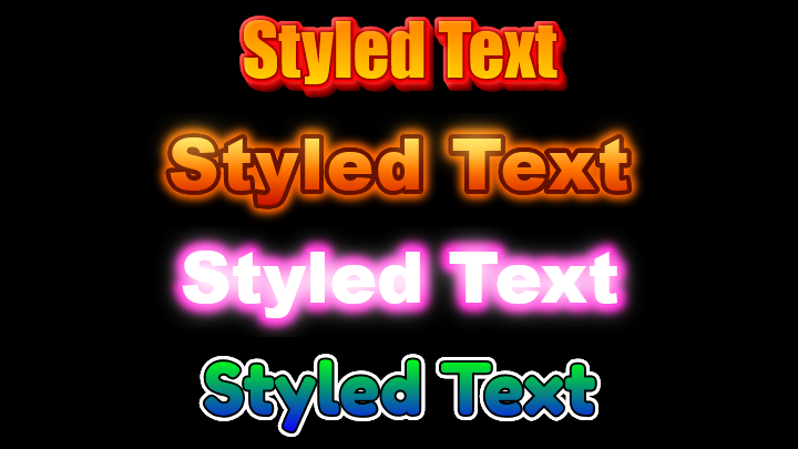
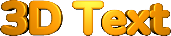
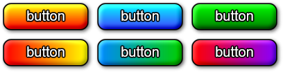
Which other tools can I use to create buttons?The Button generator creates flat and embossed buttons with gradients and outlines, and the Styled Text Generator creates text images with outlines, glow, 3D and bloom effects that you can place over your buttons.
Related tools