
Frutiger Aero icon generator
Create glossy round Frutiger Aero icons for Instagram, YouTube, WhatsApp, Discord and many other apps, or from your own SVG, and download them as PNG.
This is a free online tool that generates Frutiger Aero icons: the shiny, glassy, round icons of the mid 2000s, like the orbs of Windows Vista, the aqua icons of Mac OS X and the buttons of every Web 2.0 website.
Pick one of the more than 120 icons of the library, with the logos of the most popular social media (Instagram, YouTube, Reddit, Discord, WhatsApp, X / Twitter, TikTok, Facebook and more), apps like Gmail, Google Maps, Spotify and Netflix, and generic symbols like a star, a heart, a house or a gear. You can also upload your own SVG: upload the SVG of a star and you get a round glossy button with that star drawn inside.
The tool builds the whole glossy look for you: a sphere-like gradient, a bright oval highlight, a soft glow bouncing from the bottom and a drop shadow. Every one of those layers can be adjusted, and you can add a border, a glass rim and floating soap bubbles for the full Frutiger Aero effect.
Everything runs directly in your browser. No downloads or installations required, and nothing is ever uploaded to a server, not even your SVG.
The image is 100 x 100 pixels. The checkered squares show the transparent areas of the image: they are not part of the downloaded PNG file.
How to generate a Frutiger Aero icon?
To create your glossy icon, follow these simple steps:
- Choose the symbol - Click one of the icons of the library. Use the category list and the search field to find an icon quickly: type "maps", "music" or "chat", for example.
- Or upload your own SVG (optional) - Change "Symbol drawn inside the icon" to "Use my own SVG", then drop an SVG file, paste the SVG code in the text field, or press CTRL+V anywhere on the page with an SVG copied.
- Click one of the styles - The buttons above the preview ("Classic orb", "Aqua pill", "Frosted glass", "App icon" and the others) apply a complete Frutiger Aero style, and keep the symbol and the color you chose.
- Choose the color - When you click an icon of the library, the button gets the color of the brand. Change the icon color to use any other color, and choose whether the color fills the button (with a white symbol) or the symbol (over a white or dark glass button).
- Adjust the size of the symbol - Make the symbol bigger or smaller, and move it if it does not look centered.
- Adjust the glass effects (optional) - Change the gloss, the glow at the bottom, the border, the glass rim, the bubbles and the drop shadow.
- Download the icon - Click "Download icon image" to save the result as a PNG file with a transparent background.
Which icons are included?
The library has more than 120 icons, in three categories:
| Category | Icons |
|---|---|
| Social media | Instagram, Facebook, YouTube, X / Twitter, TikTok, WhatsApp, Reddit, Discord, Snapchat, Pinterest, LinkedIn, Telegram, Messenger, Twitch, Threads, Bluesky, Mastodon, Tumblr, Signal, WeChat, LINE, Viber, VK, Vimeo, Flickr, DeviantArt, Behance, Dribbble, Medium, Patreon, Quora and Kick. |
| Apps and brands | Gmail, Google Maps, Google, Google Chrome, Google Drive, Google Photos, Google Calendar, Google Meet, Google Play, YouTube Music, Spotify, Apple Music, SoundCloud, Deezer, Netflix, Apple, Android, iCloud, Windows, Firefox, Steam, PlayStation, Xbox, Epic Games, Roblox, Minecraft, GitHub, GitLab, Zoom, Slack, Dropbox, Notion, Trello, Figma, PayPal, Wikipedia, Waze, Uber, Airbnb, Duolingo and Claude. |
| Generic icons | Home, star, heart, settings, search, mail, phone, chat, camera, photos, music, headphones, play, video camera, movie, microphone, cloud, folder, calendar, clock, notifications, user, shopping cart, lock, trash, download, upload, share, globe, location pin, map, Wi-Fi, lightning, check, close, plus, information, help, warning, power, refresh, edit, sun, moon, leaf, water drop, gamepad, book, terminal, code, recycle, rocket, airplane, paw, like, bookmark and calculator. |
The logos come from Simple Icons and Material Design Icons, and the generic icons come from Material Symbols. All of them are free and open source icon sets.
How to use your own SVG
Any SVG can become a glossy icon: a logo, a symbol drawn in a vector editor like Inkscape or Illustrator, or an icon downloaded from an icon website. There are three ways to use it:
- Drop the .svg file on the upload area, or click the area to choose the file.
- Paste the SVG code (the text that starts with
<svg) in the "SVG code" field. You can also edit the code there, and the icon is updated as you type. - Copy the SVG file or the SVG code and press CTRL+V anywhere on the page, outside of the text fields.
By default, the whole SVG is painted with a single color, so only its shape matters: it is the classic look of the symbols of the glossy icons. Choose "Original colors of the SVG" in "Symbol fill" to keep the colors of a multicolor SVG. The empty space around the shape is removed automatically, so the symbol always fills the size you chose, no matter how big the margins of the original SVG are.
Only SVG files are accepted, because the symbol is redrawn at the exact size of the icon and stays perfectly sharp at any size. The SVG is opened as an image by your browser, so scripts, external images and external fonts inside it are ignored. Convert any text of the SVG into paths before using it, so it does not depend on fonts installed on your computer.
Icon and symbol options
| Field | Description |
|---|---|
| Symbol drawn inside the icon | Choose an icon of the library, or use your own SVG. |
| Use the color of the icon when choosing it | When this option is on, clicking an icon of the library also changes the icon color to the color of the brand (red for YouTube, green for WhatsApp, and so on). Turn it off to create a set of icons that all have the same color. |
| Remove the empty margins of the SVG | Finds the area of your SVG that is really painted and ignores the empty space around it, so the symbol is centered and fills the chosen size. Turn it off to keep the margins of the original SVG. |
| Symbol size (%) | The size of the symbol, as a percentage of the size of the icon. It is measured on the longest side of the symbol. 50% is a good value for most icons. |
| Offset X and Offset Y (%) | Moves the symbol to the right (positive X), to the left (negative X), down (positive Y) or up (negative Y), as a percentage of the size of the icon. Some shapes, like a triangle or a "play" symbol, look more centered when they are moved a little. |
| Symbol fill | "Solid color" paints the whole symbol with one color. "Gradient" paints it from a lighter tone at the top to a darker tone at the bottom, which makes it look slightly embossed. "Original colors of the SVG" keeps the colors of your SVG, and is only available for uploaded SVGs. |
| RGB split effect | Splits the symbol into two colored copies: one moved up and to the left, and the other moved down and to the right. The symbol color only appears where the two copies overlap, exactly like the TikTok logo, where the cyan and the red notes add up to a white note in the middle. It is turned on automatically when you click the TikTok icon, and can be used with any other icon or with your own SVG. "Split distance" is how far the copies are moved, as a percentage of the size of the symbol, and the two colors are the colors of the copies. |
| Draw the gloss over the symbol | When this option is on, the glossy highlight is drawn over the symbol too, as if the symbol was inside the glass. Turn it off to draw the symbol over the glass. |
| Symbol shadow | A shadow behind the symbol, which separates it from the glossy background. Its color is calculated from the color of the button, unless you choose the colors manually. |
| Size (px) | The width and the height of the icon, in pixels. The image is a little bigger, because of the padding and the drop shadow. |
| Shape | "Circle" draws the classic glossy orb. "Rounded square" draws the shape of the app icons of the first smartphones, and lets you choose the corner radius. |
| Corner radius (%) | How round the corners of the rounded square are, as a percentage of the size of the icon. 0% is a square and 50% is a circle. |
Color and glass effect options
| Field | Description |
|---|---|
| Icon color | The main color of the icon, usually the color of the brand. When the other colors are generated automatically, this single color defines the whole icon. |
| Where the icon color goes | "Color the button" fills the glass with the icon color and draws the symbol with the symbol color, which is white by default. "Color the symbol" does the opposite: the symbol gets the icon color, and the button is made of a neutral glass, with the glass color. |
| Use the gradient of the brand | Only appears for the brands whose color is a gradient: Instagram, Messenger and Apple Music. When it is on, the gradient of the brand (from yellow and orange to pink and purple, for Instagram) replaces the icon color. With "Color the button" the gradient fills the glass, and with "Color the symbol" it fills the symbol. Turn it off to use the icon color instead. |
| Body gradient | "Radial gradient" is lighter near the bottom and darker on the edges, which makes the icon look like a sphere. "Vertical gradient" goes from a light top to a dark bottom, like the glossy buttons. |
| Center X, Center Y and Gradient radius (%) | Only for the radial gradient. Center X and Center Y set where the bright center of the gradient is, as a percentage of the width and the height of the icon: 50% and 50% is the middle, 0% and 0% is the top left corner. The default, 50% and 78%, puts the light near the bottom, as if it crossed the glass. Values below 0% or above 100% move the center outside of the icon, to light it from one side. The radius is how far the gradient reaches from the center until the dark edge color, as a percentage of the size of the icon: a small radius makes a small bright spot, and a big radius makes a soft, almost flat light. For the icons with the gradient of the brand, like Instagram, these options move the light and the shadow painted over the gradient. |
| Generate the other colors automatically | When this option is on, the light and the dark colors of the body, the border color, the bottom glow color and the color of the symbol shadow are all calculated from the color of the button. Turn it off to choose each one by hand. With the radial gradient, the light color is called "Center color", because it is the center of the bright area near the bottom, and the dark color is called "Edge color", because it darkens the edges of the sphere. With the vertical gradient they are called "Top color" and "Bottom color". |
| Gloss shape | "Ellipse" draws the wide oval highlight of the glossy orbs, following the curve of the top of the icon. "Pill" draws a smaller rounded highlight floating inside the glass, like the aqua buttons. "Curved" covers the whole width with a highlight that bends down in the middle, and "Straight" cuts the highlight with a horizontal line, like the buttons of Windows Vista. |
| Gloss height and opacity (%) | How much of the height of the icon is covered by the highlight, and how bright it is. High opacities produce a wet, plastic look. |
| Bottom glow | A soft glow of light at the bottom of the icon, as if the light bounced from the surface below into the glass. "Ellipse" spreads it as a wide dome, and "Pill" draws a smaller rounded reflection. |
| Border and inner glass rim | The border is a dark outline around the icon, and the glass rim is a thin light line just inside it, like the polished edge of a piece of glass. Both are drawn inside the shape of the icon. |
| Bubbles | Translucent soap bubbles floating over the icon. Choose how many there are, how big they can be and how visible they are. The same seed always produces the same bubbles: click "Shuffle the bubbles" to try another arrangement. |
| Drop shadow | The blurred shadow below the icon, which makes it float over the page. Its color, opacity, blur and vertical offset can be adjusted. |
| Background and padding | What is drawn behind the icon (nothing, a solid color or a vertical gradient), and the empty space between the icon and the borders of the image. The space needed by the drop shadow is added automatically. |
Frequently Asked Questions (FAQ)
Is this Frutiger Aero icon generator free to use?Yes, this tool is 100% free and works directly in your browser, with no installation and no sign-up required.
Is my SVG uploaded to a server?No. The SVG is read and drawn by your own browser, on a canvas, and the PNG file is created on your computer. Nothing is ever sent to a server.
In which format is the icon downloaded?The icon is downloaded as a PNG file. When the background is left transparent, the transparency is kept in the file, so you can place the icon over any color or image.
Can I use the logos of the brands in my project?The logos of Instagram, YouTube, WhatsApp and the other brands are trademarks of their owners. They are fine for personal projects, fan art, desktop customization and links to your profiles, but each brand has its own guidelines about how its logo can be used, especially in commercial projects. The generic icons, and the icons you create from your own SVG, can be used anywhere.
How do I create a set of icons with the same style?Choose the style and the options once, then click each icon of the library and download it. All the other options stay the same. To give every icon the same color too, turn off "Use the color of the icon when choosing it".
How do I make a white glossy orb with a colored logo?Click the "Frosted glass" style. It changes "Where the icon color goes" to "Color the symbol", so the button is white glass and the logo gets the color of the brand. The "Dark glass" style does the same with a dark glass.
Does the Instagram icon have the colorful gradient of Instagram?Yes. When you click the Instagram icon, the glass is filled with the gradient of Instagram, from yellow and orange at the bottom left to pink and purple at the top right, and the light and shadows of the glass are painted over it. The same happens with Messenger and Apple Music. With the "Frosted glass" or "Dark glass" styles, the gradient goes to the symbol instead, over a white or dark glass. Turn off "Use the gradient of Instagram" to use a single color.
Does the TikTok icon have the cyan and red edges of the TikTok logo?Yes. When you click the TikTok icon, the "RGB split effect" is turned on with the cyan and red of TikTok, over a black glass. You can change the distance and the colors of the effect, and use it with any other symbol too, for a glitch or 3D glasses look.
Why is my SVG drawn with a single color?The symbols of the glossy icons are usually a single color, so the tool paints the whole shape of the SVG with the symbol color. To keep the colors of your SVG, choose "Original colors of the SVG" in "Symbol fill".
Can I use a PNG or JPG image instead of an SVG?No, the symbol must be an SVG, because it is redrawn at the exact size of the icon and must have a transparent background to be recolored. You can convert a simple black and white image into an SVG with a vectorization program, like the "Trace Bitmap" function of Inkscape.
Which size should I use for an app or a desktop icon?Use 256 pixels for desktop icons and 512 or 1024 pixels for app stores and for printing. Set the padding to 0 and turn off the drop shadow when the icon must fill the whole image, like an app icon or a favicon.
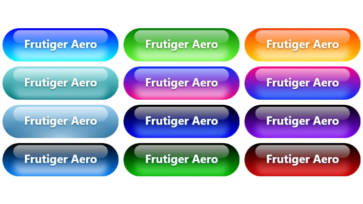
Which other tools can I use to create glossy images?The Frutiger Aero button generator creates glossy buttons with text, the Button generator creates flat and embossed buttons, and the Styled Text Generator creates text images with outlines, glow, 3D and bloom effects.